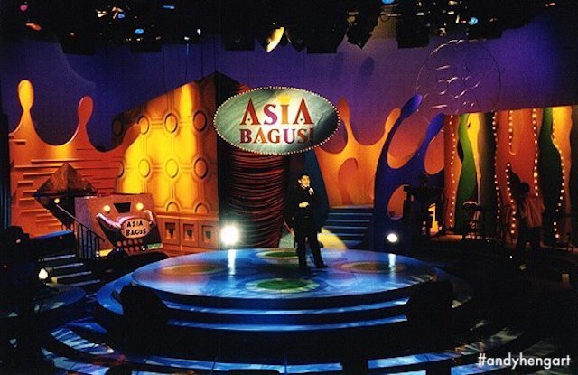
My Final Set Design for "Asia Bagus" 1998

I've always (secretly) maintained that I had managed to "live" my "Interior Design dreams" to design a "club", with my third and final ASIA BAGUS set in 1998, before I'd left the Television Corporation of Singapore.
After my colourful set for the previous cycle, I had opted for a decidedly more obvious "club" aesthetic and spacial structure, with the style focused on a quasi-"futuristic" slant (another "dream" I've had in my career, admittedly, to design for "Sci-fi"), with a foam-cushion aesthetic that I've always feared using, for a set/strike design, as I am always worried for the continued structural/form integrity of said "foam" surfaces.

And in contrast to my previous set, I'd chosen a more mono-chromatic tone for the set, of greys and reflective silvers, in an effort to have the talent's costumes "pop", and allow the lighting designer to have fun with lighting effects without, based on a prior discussion on how we could improve on the achieveable visuals = one of the main reasons why I enjoyed doing what I did! The collaboration to achieve a standard of excellence, is always something worth looking forward to, as fas as I was, and am still concerned!

Featured here are a selection of uneven line-work (more likely for my own idea conceptualisation than actual "presentation" to producers/directors, something I never allow myself to do in the first place lol), while the clean-straight lined-elevations and isometric drawings were for presentation and clarity of set/setting information.
Again, low-res images featured here, hopefully in the future to be replaced with lager snaps, if I can find the 3R photographs!
Cheers
Andy Heng
(More Asia Bagus designs & images HERE on Facebook)
P/S: I actually had a fourth set design conceptualised and doodled, but never presented before I left TCS in 1998/1999 ... might dig it out for a feature, maybe...


