About Those Logo Designs for ASIA BAGUS
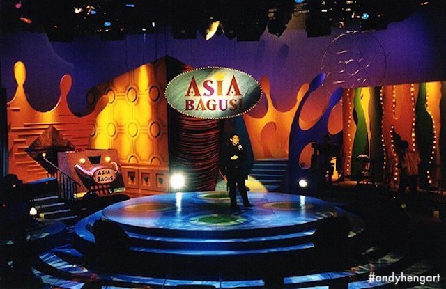
Beyond "Set Design" for television, I explored "logos" as well, in this particular case was meant to match the set and to be used on the set, if there is no “official logo” to be used, that is (which I cannot remember).
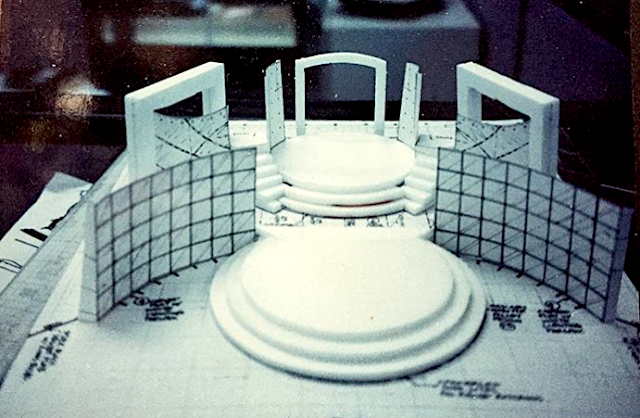
This looks to be for the 1st cycle of Asia Bagus (for #televisioncorporationofsingapore, mid-90s), matching my "Keith Harring"-inspired + Memphis-styled design surface design treatment, over an existing structure design from my predecessor. In this case I wanted it to be loud and "explosive"! But I hardly advertise this set, as it is not "fully my own", and neither do I dare claim so, cheers.
Honestly, I cannot remember if the logo was “requested for” by the show's producers, but more likely me exploring the style, because I've always liked the holistic approach to design whatever the project is, which also essentially means taking more of my time for the job! But I enjoyed myself then, and have doodles to share decades later on this blog too!


