Poster Design for SONG OF THE STORK
I was tasked with creating imagery to use for promotions of SONG OF THE STORK (2002), and I conceptualised a singular image that could be used for posters, (press) brochures, CD covers and print collateral.
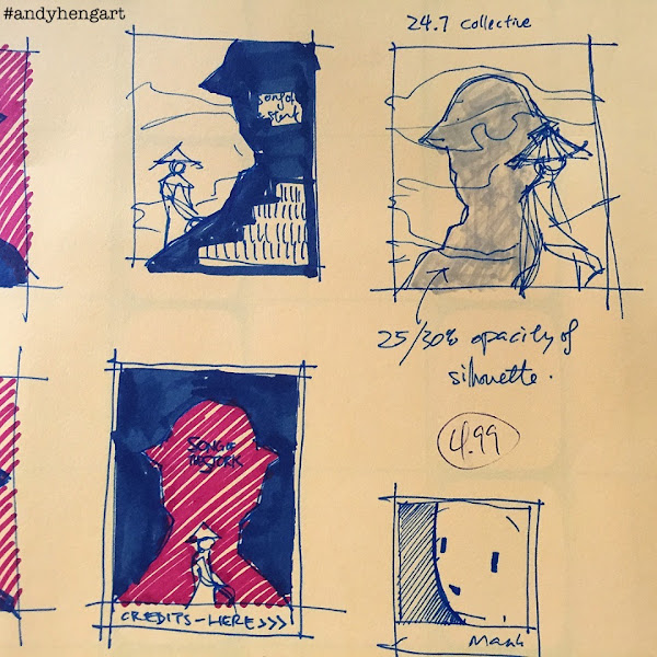
I've saved a single sheet of developmental sketches, where I explored the concept of a silhouette enveloping a lone figure, representing the "lonesome look-back"-notion of the film.
With a big cast, I'd decided to go the "multiple enlarged heads floating in the sky"-aesthetic, but knocked back like shadows in the clouds ("faint memory"), as a sole female cyclist wearing a "ao dai" (The national traditional dress in Vietnam, with a silk tunic with pants worn by women and men) stands in the forefront, holding unto a bicycle and looking back, with this image an actual footage/still from the film itself!
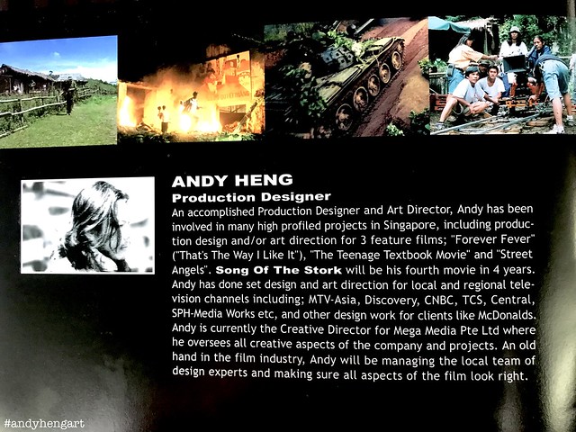
The film is anchored heavily in the 60s, with pockets of "modern Vietnam" (circa 2001-2002) connecting the scenes, and I had wanted to somehow showcase the period of history, but not too literal, like having a tank front-n-center. So a cliched "straw-cone-hat-wearing girl on a vintage bicycle" it will be.
I had in mind the color RED, as a foil to the abundance of GREEN in the feature film itself, from both the jungle and greenery, to the soldiers uniform, and a general muted palette of earth tones. The red is as well seen it in the country's flag, vibrantly so, all of which were inspired by the "modern" Vietnam scenes, of hanging red banners over the rural city, as vibrant green trees scattered through the street. And a repressentation of the broken hearts and everlasting passions, as well the bloodshed left behind in the past.
The image was conceived on photoshop, while I was in pre-production in Vietnam itself, remembering the days spent in front of the Apple G3 in the production office, with cigarette alight (which blew my mind, as folks smoked literally next to their computer OMFG). I am sure someone else converted my JPGS to CMYK suitable for print, no? I have zero memory of that, alas :p
In the end, the image went on press brochures (see video above / layout also done by myself), and other collaterals like CD covers etc.
I am personally proud of what I had achieved, even though no one else (outside of production) knows what I had done, and this is the first time I am publicly mentioneing it. My "excuse" for my lack is that I was not trained for print or graphics. I am "Interior Design"-trained! But I am always hella grateful for having the opportunities to engage in such projects, beyond my "usual" design and art direction, having a more "holistic" experience in media through the years, IMHO. I do love "designing", in all forms, cheers.
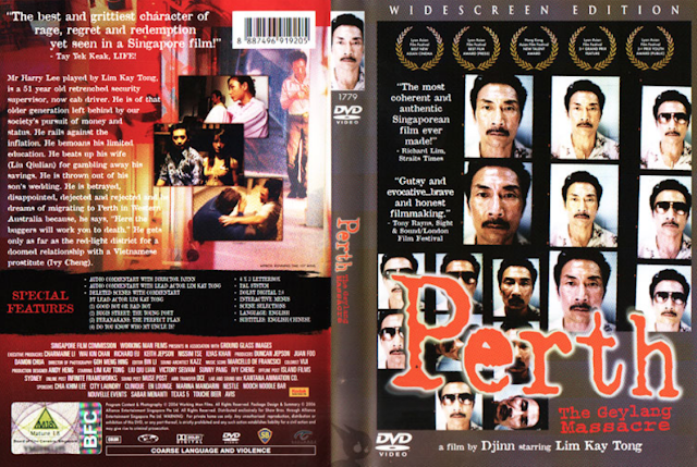
*The song titles printed in back cover seen below
are absolutely fictional, and meant for layout only :p
memories rekindled
spirits awakened"
I am proud to have authored the above text, although I look back at the result, and cringe. The "Arial Black" font that did not fit in with the main film title (which ironically I have been using for my TOYSREVIL-blog the recent year), as well my non-usage of capital letters, or even punctuation marks, is left wanting. It could have easily been:
OR
Paths Converge. Memories Rekindled. Spirits Awakened.
Over 2 decades later, it's time to "move on" from my own cringe, and this'll be the first and last time you'll read of it, cheers.
Andy
