FAME Awards 1998 (Semi-Finals)
"FAME AWARDS" was the Channel 5 English-Speaking equivalent of Chanel 8's Chinese-speaking "STAR SEARCH", and in 1998, it was both the inaugural, the only, and the last (English-Speaking) "acting"-showcase talent program/show in the Television Corporation of Singapore since.


The winner of the 1998 Fame Awards was Pierre Png, whom I would meet later again for "Forever Fever" (my first feature film, as a Art Director ... or was that "before"?), but would not be able to properly greet each other until years later for a tv series we had worked on together, titled "Rouge", for MTV Asia.
But before we had down THAT memory lane, let's back up, waaaay up back to the "Fame Awards" first, shall we?


There were two components to the show: The "Semi-Finals" and "Finals", and I was assigned design for and service both of the programs.
And while the Finals would showcase the finalists on a stage-set (Images HERE on Facebook / Which I will showcase at another time), the finalists first needed to be showcased and chosen from the Semi-Finals set, to which this blogpost focuses on.
The premise was set in a (larger scaled) "Film/TV Production House", with participants assigned specific roles in relation to the production house, performing their scripted roles.


The set itself was located on the second floor of the Radio Building, in Caldecott Hill, where stood aderelict unused office space, complete with (partial) existing carpeting, and unused electrical sockets and built-in office lighting system that needed to be spruced up and sparked (Not that the lighting would have helped in the video recording of the lights required).

And while most of my earlier set designs had been stage and studio-based (and also outside/OB-sets), this particular set had been the "closest" to my Interior Design-training (FYI: I had graduated Top of the Class in 1989 with a Diploma in Interior Design in Baharuddin Vocational Institute, my highest level of education, thanks), where spacial management crossed over with film/tv-recording sensibilities - which included physical objects such as floating walls, propped lighting, and of course an insanely minuscule budget - which I admit, was the "fun" part of the equation (I was young and foolish when it came to challenges, alas).
And in accordance to the script requirements, there had also been some spacial re-arrangements (seen in floor plans), which required juggling of tables and settings.

The set had to predominantly draw on existing fittings and props, which thank goodness paralleled that of TCS! A bulk of the budget went into refurbishing existing wall flattage, doors, while all other furnishings were existing props.
My initial colour palette was as well altered to accommodate the existing (propped) furnishings and fittings, remedied by larger splashes of wall colors, while providing a seemingly level of practicality, for the chosen wardrobe to "pop" out against. A set/setting is never to be too overt (unless requested), especially in a filming/recording scenario like this.
Look, I can happily plan spacial arrangements, draw up fancy walls and posters hanging off them, but the meat-n-bones, the real hardwork had been via my Set Decorator at that time; Mr Ian Seymour (he now directs Channel 5 shows in MediaCorp!), who quite literally and physical made my sketches "real".

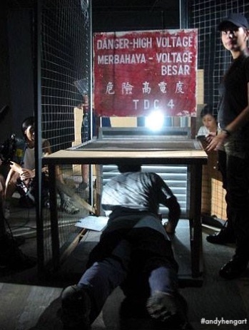
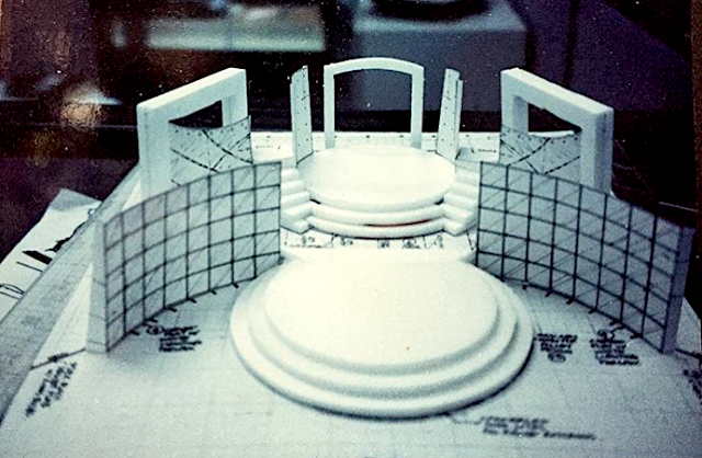
Featured here are a proposed design layout plans (based off existing building floor plans), and proposed room sketches (for both the Set Decorator, Props Department, and as well the Lighting and Grip departments to consider and plan for), and some "finished" set snaps, utilizing location house lighting, and mood/propped lighting, but not shoot lighting set-up.
The only thing - on hindsight - that grabs my attention each and every time, looking at these images, was the lack of faux-glass panels for the windows/partitions dividing the rooms - which would've been a challenge to film and avoid, but alas nary the budget to tilt said panels during fabrication/set-up! It felt as its the faux "production house" had "no budget" to do renovations!

The irony of it all was, besides these images shown, I had not have a chance to actually even watch the program itself!
"1998" was an exceedingly busy and exciting year for me, I guess.
Cheers
Andy Heng


The winner of the 1998 Fame Awards was Pierre Png, whom I would meet later again for "Forever Fever" (my first feature film, as a Art Director ... or was that "before"?), but would not be able to properly greet each other until years later for a tv series we had worked on together, titled "Rouge", for MTV Asia.
But before we had down THAT memory lane, let's back up, waaaay up back to the "Fame Awards" first, shall we?


There were two components to the show: The "Semi-Finals" and "Finals", and I was assigned design for and service both of the programs.
And while the Finals would showcase the finalists on a stage-set (Images HERE on Facebook / Which I will showcase at another time), the finalists first needed to be showcased and chosen from the Semi-Finals set, to which this blogpost focuses on.
The premise was set in a (larger scaled) "Film/TV Production House", with participants assigned specific roles in relation to the production house, performing their scripted roles.


The set itself was located on the second floor of the Radio Building, in Caldecott Hill, where stood a

And while most of my earlier set designs had been stage and studio-based (and also outside/OB-sets), this particular set had been the "closest" to my Interior Design-training (FYI: I had graduated Top of the Class in 1989 with a Diploma in Interior Design in Baharuddin Vocational Institute, my highest level of education, thanks), where spacial management crossed over with film/tv-recording sensibilities - which included physical objects such as floating walls, propped lighting, and of course an insanely minuscule budget - which I admit, was the "fun" part of the equation (I was young and foolish when it came to challenges, alas).
And in accordance to the script requirements, there had also been some spacial re-arrangements (seen in floor plans), which required juggling of tables and settings.

The set had to predominantly draw on existing fittings and props, which thank goodness paralleled that of TCS! A bulk of the budget went into refurbishing existing wall flattage, doors, while all other furnishings were existing props.
My initial colour palette was as well altered to accommodate the existing (propped) furnishings and fittings, remedied by larger splashes of wall colors, while providing a seemingly level of practicality, for the chosen wardrobe to "pop" out against. A set/setting is never to be too overt (unless requested), especially in a filming/recording scenario like this.
Look, I can happily plan spacial arrangements, draw up fancy walls and posters hanging off them, but the meat-n-bones, the real hardwork had been via my Set Decorator at that time; Mr Ian Seymour (he now directs Channel 5 shows in MediaCorp!), who quite literally and physical made my sketches "real".

Featured here are a proposed design layout plans (based off existing building floor plans), and proposed room sketches (for both the Set Decorator, Props Department, and as well the Lighting and Grip departments to consider and plan for), and some "finished" set snaps, utilizing location house lighting, and mood/propped lighting, but not shoot lighting set-up.
The only thing - on hindsight - that grabs my attention each and every time, looking at these images, was the lack of faux-glass panels for the windows/partitions dividing the rooms - which would've been a challenge to film and avoid, but alas nary the budget to tilt said panels during fabrication/set-up! It felt as its the faux "production house" had "no budget" to do renovations!

The irony of it all was, besides these images shown, I had not have a chance to actually even watch the program itself!
"1998" was an exceedingly busy and exciting year for me, I guess.
Cheers
Andy Heng


