Set Design: Asia Bagus 1998
BROADCAST PROGRAM: "Asia Bagus" (1998)
WHAT-IS: Set Design for P5 of Television Corporation of Singapore (#TCS)

"Asia Bagus" was essentially a "singing talent" show, a precursor to the current trend of singing programs, with the finalist(s) crowned the best singer for the region at the end of each cycle (This is the "Singapore" leg of the competition), and culminating in a overall champion at the end of the season, with a competition held in Japan.
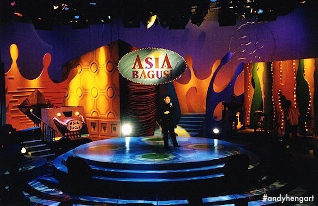
After inheriting the set from the previous set designer, I had created three different set iterations for Asia Bagus, up until 1998-99, when I had left TCS as an in-house Set Designer. Featured here is one of the sets (2nd of 3), that was built/set-up and recorded in the TCS TV Theatre studio, the only studio in Caldecott with a permanent audience seating.

The set requirements included: A main performing stage, a "Judges" seated area, and a DJ (disc-jockey) booth. There is also an additional contestants seated area.
As it was the beginning of a new season/cycle, I was basically given free-rein to re-imagine the set, based on a limited budget (of course). I had the opportunity to design and have fabricated a predominantly brand new setting, versus the previous incarnations which included recycling and repainting old(er) settings from other shows, to incorporate into the master set. This set as well still incorporated recycled elements (as is the practise for most if not all of the tv broadcast sets back in the day).


For this incarnation of Asia Bagus, I had opted for an "explosion" of club fun, with a robot-DJ booth (admittedly the nexus of my design concept), while at the same time trying to achieve the feel of "different parts of a dance club" - which the main erfomance stage would be the "dance floor", while the Interview Area would be a "VIP Corner" of the club.
For the "Judges Area" in this incarnation, the producers had requested for a seating with a "less serious" atmosphere, as opposed to sitting behind a table/dessk. In this instance, they would have a clipboard in hand, while looking at playback on on-stage monitors, which I opted for a "cafe" concept seating instead, and being able to capture said judges (unlit) in the background, as Cam A focused on the performer.
This ultimately was not as successful (I feel), as it might restrict Judges' wardrobe(s), and even becoming a distraction (even though we dim the lighting so we don't get to see judge's facial reactions to the singing lol). My subsequent (and last) set design for Asia Bagus would have the judges behind an entire "bar".


One of the key requirements and emphasis would be on the main stage, primarily of the performer, with elements of the set(ting) behind him/her providing a level of visual interest, but not take attention away from them.
And as well it had to be versatile enough to encompass different lighting conditions, which suited each individual song performed. Most folks loved to perform (power) ballads, so there's be a lot of darkened hues and I had wanted to provide "silhouettes", versus overworking the lighting.

And because my palette was stronger primary colours, I had worked with the lighting designer and proposed a deeper and "richer" hue to be achieved. The spotlight will ever be focused on the performer, while I had hoped to embrace said performer with a deeper palette with include "coloured shadows" by way of the darker lighting tones on the shaped background.
On the same token, I had wanted both a visual interest and colours for when performers sung brighter and more upbeat songs, without the need for overt lighting effects, other than being able to tasteful light-up the stage enough, and at the same time provide a semblance of texture(s) beyond the flat surface.
I had designed the set intentionally to cater to mid-to-close shots, with providing silhouettes and textures behind them. And knowing this incarnation would last only a cycle/season of broadcast, I could afford to push viewers interest only so far, without them recognising and tire of a overt design in subsequent season(s).
The establishing shot only ever happens in a split-second opening of the show/program, and maybe bumpers in from commercials ("maybe"), interspersed sparringly with long-shots during performances.
So geographical space management and even floor design would remind viewers of a visual impression, but not need to tell a story, which to me, is always a fun part about designing for "Variety", and vastly different from story-based television, much less feature film(s).
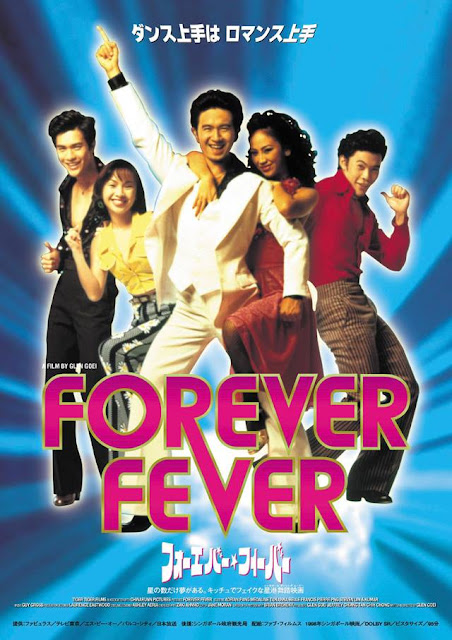
If my addled memory has not failed me at this time (of publishing this post), I had more like not yet started on my first feature film ("Forever Fever"), but had understood the importance of lighting design with regards to any and subsequent designs and films projects I have undertaken.

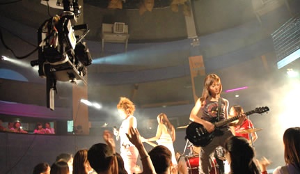
But because this show has a "live" studio audience for every recording, I also considered their viewing experience (something I am personally interested in, anyways), even though it might not be something they would "need" to remember - wouldn't that be great? But that's not the function of this set design - but an environment that enhances their enjoyment of the performance, has always fascinated and interested me.
I had managed to sit in for camera and lighting rehearsals, to capture the images posted here. There are quite a few more - showcasing different lighting conditions - taken when I was seated right next to lighting control with the lighting designer (hence not via the camera POV), and will upload them once I find the analog pictures.
The coloured illustrations were my literal presentation images to the client (producers + directors). Apologies for the low res quality (from scans of the laser-printed copy), and I will attempt to upload if ever I find the original hand-rendered drawings.
(Head here to my dedicated Facebook album for Asia Bagus designs)
Cheers
Andy Heng
WHAT-IS: Set Design for P5 of Television Corporation of Singapore (#TCS)

"Asia Bagus" was essentially a "singing talent" show, a precursor to the current trend of singing programs, with the finalist(s) crowned the best singer for the region at the end of each cycle (This is the "Singapore" leg of the competition), and culminating in a overall champion at the end of the season, with a competition held in Japan.
After inheriting the set from the previous set designer, I had created three different set iterations for Asia Bagus, up until 1998-99, when I had left TCS as an in-house Set Designer. Featured here is one of the sets (2nd of 3), that was built/set-up and recorded in the TCS TV Theatre studio, the only studio in Caldecott with a permanent audience seating.

The set requirements included: A main performing stage, a "Judges" seated area, and a DJ (disc-jockey) booth. There is also an additional contestants seated area.
As it was the beginning of a new season/cycle, I was basically given free-rein to re-imagine the set, based on a limited budget (of course). I had the opportunity to design and have fabricated a predominantly brand new setting, versus the previous incarnations which included recycling and repainting old(er) settings from other shows, to incorporate into the master set. This set as well still incorporated recycled elements (as is the practise for most if not all of the tv broadcast sets back in the day).


For this incarnation of Asia Bagus, I had opted for an "explosion" of club fun, with a robot-DJ booth (admittedly the nexus of my design concept), while at the same time trying to achieve the feel of "different parts of a dance club" - which the main erfomance stage would be the "dance floor", while the Interview Area would be a "VIP Corner" of the club.
For the "Judges Area" in this incarnation, the producers had requested for a seating with a "less serious" atmosphere, as opposed to sitting behind a table/dessk. In this instance, they would have a clipboard in hand, while looking at playback on on-stage monitors, which I opted for a "cafe" concept seating instead, and being able to capture said judges (unlit) in the background, as Cam A focused on the performer.
This ultimately was not as successful (I feel), as it might restrict Judges' wardrobe(s), and even becoming a distraction (even though we dim the lighting so we don't get to see judge's facial reactions to the singing lol). My subsequent (and last) set design for Asia Bagus would have the judges behind an entire "bar".


One of the key requirements and emphasis would be on the main stage, primarily of the performer, with elements of the set(ting) behind him/her providing a level of visual interest, but not take attention away from them.
And as well it had to be versatile enough to encompass different lighting conditions, which suited each individual song performed. Most folks loved to perform (power) ballads, so there's be a lot of darkened hues and I had wanted to provide "silhouettes", versus overworking the lighting.

And because my palette was stronger primary colours, I had worked with the lighting designer and proposed a deeper and "richer" hue to be achieved. The spotlight will ever be focused on the performer, while I had hoped to embrace said performer with a deeper palette with include "coloured shadows" by way of the darker lighting tones on the shaped background.
On the same token, I had wanted both a visual interest and colours for when performers sung brighter and more upbeat songs, without the need for overt lighting effects, other than being able to tasteful light-up the stage enough, and at the same time provide a semblance of texture(s) beyond the flat surface.
I had designed the set intentionally to cater to mid-to-close shots, with providing silhouettes and textures behind them. And knowing this incarnation would last only a cycle/season of broadcast, I could afford to push viewers interest only so far, without them recognising and tire of a overt design in subsequent season(s).
The establishing shot only ever happens in a split-second opening of the show/program, and maybe bumpers in from commercials ("maybe"), interspersed sparringly with long-shots during performances.
So geographical space management and even floor design would remind viewers of a visual impression, but not need to tell a story, which to me, is always a fun part about designing for "Variety", and vastly different from story-based television, much less feature film(s).
If my addled memory has not failed me at this time (of publishing this post), I had more like not yet started on my first feature film ("Forever Fever"), but had understood the importance of lighting design with regards to any and subsequent designs and films projects I have undertaken.

But because this show has a "live" studio audience for every recording, I also considered their viewing experience (something I am personally interested in, anyways), even though it might not be something they would "need" to remember - wouldn't that be great? But that's not the function of this set design - but an environment that enhances their enjoyment of the performance, has always fascinated and interested me.
I had managed to sit in for camera and lighting rehearsals, to capture the images posted here. There are quite a few more - showcasing different lighting conditions - taken when I was seated right next to lighting control with the lighting designer (hence not via the camera POV), and will upload them once I find the analog pictures.
The coloured illustrations were my literal presentation images to the client (producers + directors). Apologies for the low res quality (from scans of the laser-printed copy), and I will attempt to upload if ever I find the original hand-rendered drawings.
(Head here to my dedicated Facebook album for Asia Bagus designs)
Cheers
Andy Heng


