Set Design: The 1997 Silver Screen Awards @ Westin Stamford (Set Design for TCS)

Besides designing for in-house film studios in Caldecott Hill, I had the opportunity to design for sets for "Outside Broadcast" - AKA "OB", through my 4 and 1/2 years tenure at the Television Corporation of Singapore, and one of the more memorable ones was for the 1997 Edition of the Silver Screen Awards.
Memorable because personally I had been a fiend for SGIFF showings/films, and had participated in multiple viewings for some time, and being able to be a small apart of that, was pretty exciting!
The Opening film fo that year was Mohsen Makhmalbaf's ""GABBEH" (who won "Best Asian Feature"), and the closing film was Lars Von Trier's "BREAKING THE WAVES".
On the local/SG front, Eric Khoo won the NETPAC/FIPRESCI AWARD for "12 Storeys", while Wee Li Lin won Best Director for "Norman on the Air" (short film), while Chee Kong Cheah / CheeK's "Beansprouts and Salted Fish" won BEST SHORT FILM and SPECIAL ACHIEVEMENT AWARD.
Inspired and excited for an opportunity to go into film (although I did not meet any one of the filmmakers named), and it was not until 1997/1998 when I worked on my first feature - for director Glenn Goei - that I had started on my short journey in local film.

The set was to be at Westin Stamford, and involved a whole set of logistics similar with, but at the same time wholly different than "in-house", "logistics" which I had learnt on the job, which subsequently helped me navigate my first feature film too.
Conceptualizing and designing is one thing, but "logistics" is one of the key aspects of any project (no, not just "budget"), which helps shape said design and the execution of the design (setting and striking). If memory serves, this was one of my earliest "OB"-settings as well, and it was quite an eye-opening on-the-job-learning curve!


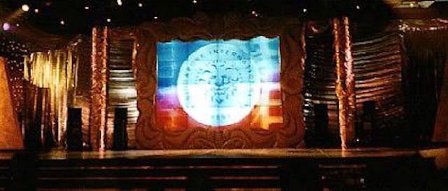
With the lack of location (ballroom) height, I had decided to go "length"-wise, in an attempt to replicate a movie-esque wide-screen spacial visual (even though the video wall is a regular TV ratio), and planned for a "flat" landscape design as well because the shots would be tighter (a whole lot of Mid-shoots and MCU), with this set predominantly for the audience's viewing pleasure, and of course for "live" broadcast.

By wrapping most every surface in "gold" - particularly with different "textures" - was to accommodate the brightly-lit up stage whenever the hosts/compared announced/or accepted winner(s). I know, I know; "Silver Screen Awards" versus "Gold" - I wanted a faux kitsch glamour, what can I say?
At the same time, I'd worked with the lighting designer to try and achieve a more dramatic lighting scheme (seen in low-res images here), in contrast to aid brighty-lit instances, and he blew me away with each set change!
The only "down-side" to the design, was perhaps being able unable to cover up the lighting equipment parked on stage right in front go the set-surfaces, as I have regularly learnt to do for in-house studio sets (Something I had always been particular about, of budget afforded it, of course).

Regardless the details, the result was a set I remembered enjoying thoroughly and was satisfied with. I personally liked the flanking circular SIFF logos, which acted like eclipsed suns/moons when the stage dimmed and coloured changed for performances. Maybe one day I'b be able to find the original images and re-scan them to showcase here.
Cheers
Andy Heng
(Images posted here on Facebook)


